How to make a cool website? 6 ridiculous(ly good) tips

Wow, what a question. How to make a cool website is almost like little Timmy asking “Hey Mr, what’s life?”. Well thankfully for you fine folks we can answer the cool website question, however, you’re on your own with the meaning of life. Now let’s address the elephant in the room. We collect, better, we hoard cool websites (and by all means feel free to have a look around some of them from the discover page), however what makes a cool website? How do we decide what’s cool and deserves to be hoarded?
One might answer with “mind your own business pal” or “it is what it is” (thanks Jamal for the ear worm), but that’s not cool nor useful for you folks out there trying to create something remarkable, enjoyable and potentially, why not, remunerable.

Now, let’s get one thing clear, we’re not going to tell you how to maximise revenue on your poorly designed landing page, we’re not going to explain the principles of font pairing or desperately convince you that white space is not a waste of space. Remember, we’re just here to provide you with some useful tips on how to make a cool website.
Before we get deep into the tips, first think about this
What makes a website cool is the idea behind it
Cliff from Bored Hoard
Boom, mind blowing twitter post, show’s off, close the curtains, see you next time.
All jokes aside, that statement above really is the summary of what we’ll try to explain next. Because it doesn’t matter how cool is the animation of your menu, it doesn’t matter if the button on your page pulsates and makes a backflip, it doesn’t matter if after completing an action your site displays an animation of 45 elephants flying around the screen dropping fireworks into the galaxy (well that’s actually a damn cool idea), what really matters is the purpose behind your website. If you already know that, then you already know how to make a cool website.
Your website can read my mind and provide me with a beverage at the right temperature any time I need it? That’s a cool website idea. Your website is a dropship selling knock off products? That sucks and we won’t be hoarding you (no harsh feelings).
How to make a cool website, let’s begin…
Without further ado, let’s explore how to make a cool website, and whilst we’re at it, how to get accepted into The Hoard. We’ll also provide a few examples of sites we currently have on the Hoard, so you can see what good (heck maybe even great) looks like.
1 – Don’t spam or clickbait
Yeah we get it, you want more people to read your stupid recipe to make pizza at home to maximise your ad revenue. Well first of all, I’ll be the judge of that pizza, but most importantly if I land on your website only to be welcomed by a waterfall of banners selling me insurance policy (that ain’t reassuring for a cooking blog btw), another 3 popups to join your mailing list (again, slow down, we haven’t had dinner yet) and some more cookie crap, well that ain’t gonna make my cool meter go up, in fact I’ll close that site in the blink of an eye, ‘cause guess what? Nobody likes a salesman (unless you’re Leo, and you’re not).

Now we can’t exactly suggest a single site here as an example, because every site on the Hoard is on board with this rule. That’s right, none of them spam see for yourself. Each on of these fine specimens of a site know exactly how to make a cool website.
2 – Your copy is bad
Surprise surprise we believe that content is the most important part of a website or blog or product…actually everything. Picture this, you just met someone and you’re about to have a conversation, would you rather have someone telling you something interesting about their past or future experience which can resonate with you and establish a connection or having a dull conversation stating the obvious about the weather outside?

If you’re not British I’m sure you picked the first option, ‘cause of course everyone wants to be able to relate to others and everyone wants to be part of a group of like-minded people to share experiences and talk about what they think is cool. For example, you’re here right now because you want to find out how to make a cool website aren’t you? If you’ve gotten this far, we must be doing something right.
So why in the heck do you think the same doesn’t apply to your site for Chtulu sake! Why use dull corporate copy when your website is about, I don’t know, bungee-jumping while eating pizza? (sorry I have a thing for pizza).
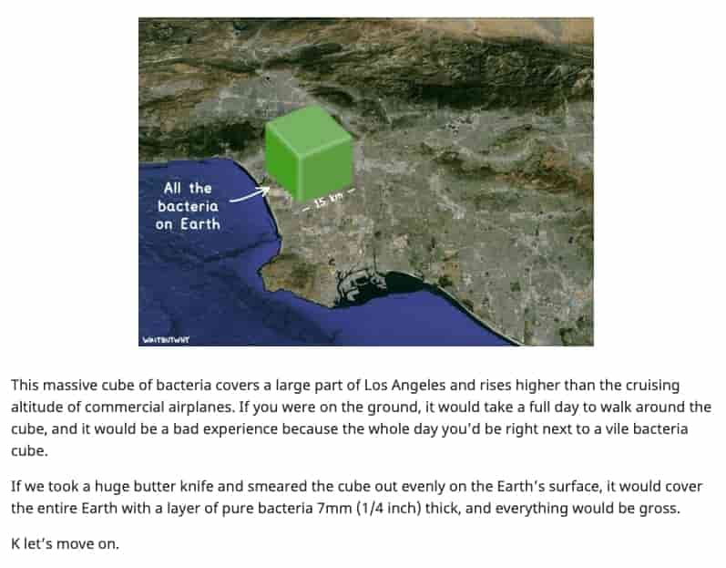
Wait But Why – These fine folks really know how to make a cool website and how to really connect with their audience and what makes for good reading. They don’t care if their content isn’t to everyone’s liking, because they’re not trying to please everyone. Sounds familiar huh?

3 – Optimise your images
Now I’m not saying you should necessarily hire a designer, especially if you’re just creating an MVP (I’m not talking about Tom Brady, get a grip), but honestly, what makes you think your users will enjoy your stretched banner in which your carefully chosen font (Arial) is stretching vertically like Japanese salarymen in the subway?
Just make an effort to ensure what you put on is good. “But how do I know that Cliff?” I hear you asking. Easy schmuck, ask those other humanoid figures around you, can’t be easier.
Then again, you don’t have to use pixel perfect images or buy expensive softwares for photo manipulation. That’s not what makes a website cool. We use pixelated GIFs for example and I dare you say we’re not cool.

But maybe you’re here for some resources on how to make a cool website and give you a little nudge. Sure my new friend, here it comes:
Lordicon – Easy animated icons for your project
Tailor Brands – Let someone else create your logo
Avatar U – An avatar of yourself
My live signature – A signature not written by a child
Panzoid – Templates for your YouTube videos
There’s a ton more of this obviously cool stuff in every single weekly box we release, here’s a link to the discovery page. Extra tip, create an account and bookmark your favourites so you won’t have to remember them.
4 – Don’t stress over being unique
Ok now we’re getting to the meaty part or in my case the pizza sauce (ok I’ll stop it). If you have some cool website ideas but every time you search for it someone else has already created it, do not despair, cause it would be pretty hard to come up with something no one has ever created before.
Let me give you context, in September 2014 humanity reached 1 billion, yes with a “b”, websites created and the number is obviously multiplying exponentially. Websites are way easier to make now than they were just 5 years ago, hell, pets have websites and social profiles (which they probably created themselves).

So chances are your idea was already explored, developed, tested, released, failed, resurrected and died again. Does that mean it won’t work? Not a chance fella. As for many things in life, “the what” is not the only component of making something successful or cool in our case, there are several different variables including environment, timing, branding, position, reachability etc.
Think about it, if “the what” was what only mattered, you’d probably be the boss of your boss… So don’t beat yourself down if your cool website idea about an app that tracks your office ping pong games can already be done with Excel, ‘cause that’s not necessarily cool.
Oh if you need more live internet data you can check out this cool website we featured in Box 58.
5 – Find your own voice
In this time and age, and we’re referring to the dumpster called social media, people are overloaded with information. You wake up in the morning and the first bloody thing you touch is your phone, how sad. Presumably that’s because as you sit on the john you can read that very important email with “your very own” discount coupon, or you can’t just cry about nobody liking your dumb Instagram post.
But one thing potentially good about social media is that the old age methods of communicating with your audience are outdated, they don’t work anymore and they’re just considered spam. People like to see your true self, people want to connect with you on a more personal level, they want to be able to pick apart your life, discover your secrets, criticize you and talk about you. Again, how sad. But if you think about it, that’s how your real life circle of friends works too (well, if you have one that is), it’s just amplified to, potentially, billions of people.

So what am I really trying to say here? Being yourself with your website helps you in shaping your branding and since it’s you, you can’t fake it, all the way through. Sure, you can also be someone else, as long as you can keep consistency and you know exactly who. It is a combination of all these traits that will really help you to figure out how to make a cool website.
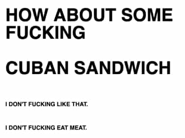
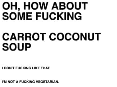
Now these guys we featured in Box 29 might have admittedly taken it to the extreme, but just spend a moment to appreciate it. No bells and whistles, straight to the point, super easy to use and it puts a giggle to your face. How cool is that?
6 – Not everyone likes you
Deal with it. If you’re that kind of person that feeds off people’s compliments, then stay off the internet, honestly, it’s nasty out there. I’ve heard of countless influencers, streamers, websites, podcasts closing because of the barrage of negative comments received.
Develop a thick skin or better still learn to read between the lines. A negative comment sometimes can be read as a way of improving as long as it’s not just insults. Learn how to respond and interpret those comments in a way that makes you improve your website, feelings can uncover problems, which can lead to solutions, which can be implemented in a cool way. And you’re the one doing it, or the guy on your books I guess.

How to make a cool website…complete
And that’s all for today folks, 6 ridiculous(ly good) tips to answer your question “How to make a cool website?”. If you want more examples on cool website, you can obviously go ahead and discover the Hoard yourself. If however you can’t be bothered, we’re also able to spoon feed you with our article about 80+ fun, interesting and cool websites to visit in 2021.
There’s a lot more that can be said about this topic, and trust me we will do so, therefore stay tuned with our mailing list and social media, maybe create an account for good measure to join the Hoard. It’s fun here, people are cool.

kghjghkdf
8 April 2022 at 10:49 pmThanks!