- Leave a review
- Share
- Claim page
- Report
- prev
- next
Why hoard it?
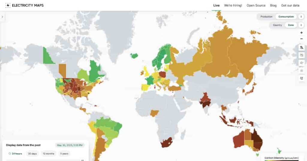
This site is a live 24/7 visualization of where your electricity comes from and how much each country consumes, which is reflected based on color. The darker the color, the more carbon is being used and ultimately contributing to climate change.
Tags
Video
Add a review
Leave a Reply · Cancel reply
You must be logged in to post a comment.
Bored Hoard
10 May 2024 at 12:32 pmThis site is a live 24/7 visualization of where your electricity comes from and how much each country consumes, which is reflected based on color. The darker the color, the more carbon is being used and ultimately contributing to climate change.